Rounded avatars have taken all over the web design world, you see them everywhere but mostly on those websites that follow the ‘Flat User Interface’ trend which started to gain weight after the release of Windows 8. Using rounded avatars will provide a cleaner look to your design, a more aesthetically pleasing way to display user images; the circular shape makes white space help your layout and will give you an easier way to align your user information. Dynamic as it is, the circular shape of rounded avatars are an advance from a squared image but you need to be consistent with your overall design, you might want to use rounded corners on your other UI elements such as call to action buttons and iconography.
The way you can achieve this is using a CSS3 property called “border-radius” which is now supported by a large range of browsers. Now let me explain how it works, border radius allows you to set the border of each corner a certain radius, making it rounded to a certain degree. For example, if you have a DIV (a box) with a size of 500 x 200 pixels; if you add a border radius to the top right corner of this box (let’s say 30 pixels of border radius), your box will end up with a moderated amount of roundness on that corner, it will make it look like a quarter of a circle which radius is 45 pixels.
How to make a circular shape
Border radius, when the box is a regular square (both width and height are equal) and your border radius value for ALL the corners is half the size of one side of your box, it will produce a nice and perfect circle. It makes sense, you can have a square that’s 50 x 50 pixels and give it a border radius of 25 pixels… or you can set the value to just 50%; both work!
First, add the image in HTML
Okay, we need to tell our document that we have an image in da house, you can do two things: use a div with a background image (your avatar) or an image tag that links to your avatar. Both are okay but I prefer the straight image tag because using a background image could cause a rendering problem with the border; But don’t take my word for granted and try whatever works for you! The key is to experiment as much as you can, do not fear CSS.
<div class="avatarBox">
 <img src="nina.jpg" alt="Nina" title="Nina">
</div>
<div class="avatarBox">

 <img src="peter.jpg" alt="Peter" title="Peter">
</div>
<div class="avatarBox">

 <img src="jodie.jpg" alt="Jodie" title="Jodie">
</div>
In case you are lost for a bit, I decided to add three avatars chosen from my likers/followers’ archive, but these 3 are special, Jodie is an amazing novel writer aspiring author who blogs about books; Nina posts gorgeous photos with urban landscapes and foggy buildings which I absolutely love; Peter has an amazing collection of movies that he’s reviewed (aren’t my readers beautiful?). These 3 fellas are good material to follow so I chose their avatars for this example. Now get this right, some web developers choose to wrap the image tags within DIVs with a class (mostly, “avatar”) but I prefer to leave the images alone. Wrapping them with DIVs can help to add extra borders and overall effects, that’s what I’m gonna do.
Image tags are simple to understand, we add them the OBLIGATORY src (source) attribute linking to the avatar image, the title and alternative text are not what’s important here. Now let’s get to CSS, but before allow me to introduce you to 3 of my many favourite WordPress.com bloggers (the ones I mentioned).


Styling the avatars with CSS
Just in case, you need to add the following code in your CSS stylesheet file, you can also use inline styles for testing (adding the attribute “style=”thing: value; thing2: value2;” and so forth). I will explain this after the code, but I challenge you to examine it for some minutes before reading the dissection.
.avatarBox {
  border: 1px solid #DDD;
  width: 110px;
  height: 110px;
  -webkit-border-radius: 50%; /* Can also be 55px */
  -moz-border-radius: 50%;
  border-radius: 50%;
 }

.avatarBox img {
  margin: 5px;
  -webkit-border-radius: 50%; /* Can also be 50px */
  -moz-border-radius: 50%;
  border-radius: 50%;
 }
Time to dissect the code above. First, to target the containing box we put a dot followed by the class name (classes are targeted with dots, and IDs with hash # symbols). The results are as follows, I added a link but don’t pay attention to that detail, haha:
The properties of the .avatarBox DIV container class
Border: I want to add a border which is 1 pixel thick, I want it to be solid and have a colour of medium gray (#DDD is the short for #DDDDDD, these are hexadecimal colours).
Width and Height: If I don’t set these values, it will take the whole parent element’s width and the height will be equal to its children’s total elements’ height. But why 110 pixels and not 100? Because I wanted to give it an extra border, which is, in term, just a breathing room (if your background is dark, try adding the CSS background-color property to the box class, set it to white if you want, remember, type “white” or “#FFFFFF“) using white space.- The breathing room will be a total of 5 pixels wide, not 10, because we have 5 pixels on the left and 5 pixels on the right both making a total of 10 pixels for the width property; same goes for the height property (top and bottom); remember, we are using a square!
Also, as it says some lines below, you could set it to 100 pixels and add the desired 5 pixel padding (or the value you want) and not adding margin on the image.
Border radius: As explained earlier, it adds a quarter of a circular shape to each corner, when we set the values for all the corners for half the size of each side of our element, it will produce a perfect circular shape. Easy geometry, mates! Radius equals half of the diameter. You have two options here, add 50% (percentage values are popular nowadays, with all this responsive design thing, fluid layouts took a bigger importance than before) or the exact half using pixels, both are OK and will give you good results. Why 3 properties? We could add border-radius but it would only work in Chrome, that’s an advanced browser and adapts CSS3 more quickly than the rest; if you want to add support for Mozilla and Webkit (Safari for example) browsers you need to add these prefixes.
Quick Tip: If you think you are repeating yourself, use a class just appended to the main one for the CSS3 effects (radius, shadow, transitions) or target multiple values using a comma.
The properties for the image
When we want to target elements within parent elements, and thus not affecting other elements with the same name within other containers, we first type the parent element we desire to target and then a space followed by the child element’s (if you want a specific child, use a class or ID, like this: specific-parent child.Specific or child#Specific) name. That’s why I chose to type in .avatarBox img { properties }, because if we just tell to the browser “img { properties }“, it will target ALL the images in our document… and we don’t want our precious picture of us eating pancakes clipped inside a circle, right?.
Height and Width: No need to specify, don’t add these properties unless you really need to change them.
Margin: We need to center our image, and the best way to do this is using automatic margins. What does that mean? it will take half of the remaining width and height and add it to the bottom, top, left and right sides of the image, this way it will be centered no matter how big the container element is. One single value of “auto” tells the browser that we need that for every side. On another quick note, you could also avoid adding extra size to the box class, and just put the original size (100 x 100 pixels); then all you need to do is add padding instead of margin. Padding will also make the element bigger without having to put that on the width and height properties.
The border-radius is self-explanatory, pay good attention to what I’m doing, because you will experiment with these things on your own! Let’s say we want the images to have an opacity of 80% whenever we hover over them. Easy, add the following code using the CSS opacity property, 0 to 1, using decimals to trigger our percentages (0.5 for 50%, 0.95 for 95% and more, I think you catch the drift).
.avatarBox img:hover {
  opacity: 0.8;
}
Did you notice? A :hover CSS pseudo-class was added, that’s how we target the event of a mouse hover over. Also, the boxes with the avatars are floated to the left, this is not important for this tutorial but don’t be surprised that when you are testing, your images will be displayed one below each other instead of inside a row.
If you have any question or feedback to give, please comment down below or check out the Contact page on the header menu. Remember that we are all humans and we make mistakes, so if you notice any coding or grammar/spelling mistake(s) please, pleeeaaaase let me know, m’kay?
Show me what I can make the avatars look like
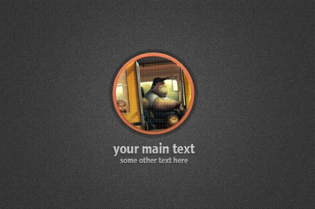
This is what others normally do with their rounded avatars, check them out and decide what style you fancy for yours.
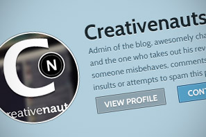
 Creativenauts
Leave a reply to Luis C.C.S Cancel reply